Design is Art
Design is Expression
Design is Communication
My skills in design have touched every aspect of my life. I've created professional posters for my band, designed and hand-printed merchandise, and even used my knowledge of art and design principles behind a video camera. I've honed and used my skills as Infographic Editor, Design Editor, and Editor-in-Chief of The Communicator, my school's magazine that was awarded 1st and 2nd place nationally in 2018-19 and 2019-20, respectively. I use Adobe Suite, especially Illustrator and InDesign, to perfect my designs, and I'm passionate about creating clean, minimal content that makes you look twice.
Magazine
Design
Below is a sample of the many designs I have done during my time on The Communicator. Use arrows to navigate spreads.


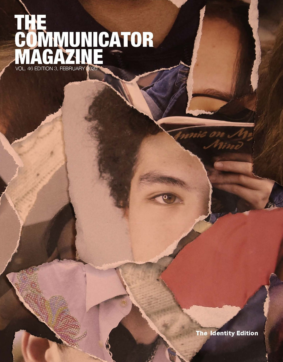

2019-20 Cover Designs
As Editor-in-Chief, I have led brainstorming and design efforts for each cover. As we transitioned to themed editions (violence, technology, and identity, respectively), I've focused on representing the essence of each topic and featured articles through minimal imagery and abstract photography.
The Revolution Digitized
I designed this three page spread for my friend's article on the rise of digital campaigning in grassroots progressive movements. The theme for the edition was technology, and the themed element was binary code. I used this imagery on protest signs to represent technology paired with movements of the people.
You Can't Really Tell Change Until It's Over
This page design is for an article I wrote about the experiences of a black girl at my school. She frequently feels tokenized, but the article focuses on the ways she deals with that tokenization. Eyeliner gives her strength, so I kept the design simple to focus on the power of her photo and eyeliner, as well as a powerful quote about forward change.
How We Listen to Music 1973-2016
Representing some of my best infographic work, this visual representation of the popularity of music mediums perfectly lent itself to an audio waveform shape. It won first place for infographic at the Michigan Interscholastic Press Association conference.


2019 Templates
As Editor-in-Chief, I had the opportunity to redesign The Communicator for the 2019-20 school year. We worked tirelessly to choose fonts, page layouts, grids, and styles to create consistent, beautiful magazines. Above are some example pages that show the outcome of that work.


A Guide to Waste at Community High School
This is a three-page spread I worked on for a project I did in collaboration with Ella Edelstein. We dumped out trash and recycling from around the school, sorted it into three groups, and took photos of the items, which we then used graphic elements.
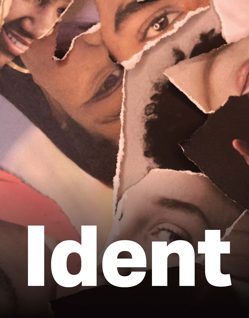
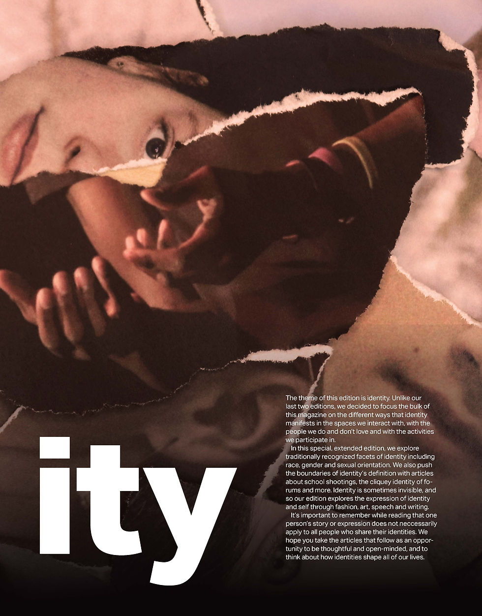

Identity Edition Intro Spread
For the third edition of 2019-20, we decided to focus entirely on the facets of identity and how it manifests throughout our lives and society. I wrote an introduction to the section, and I designed it as a callback to the collaged cover.
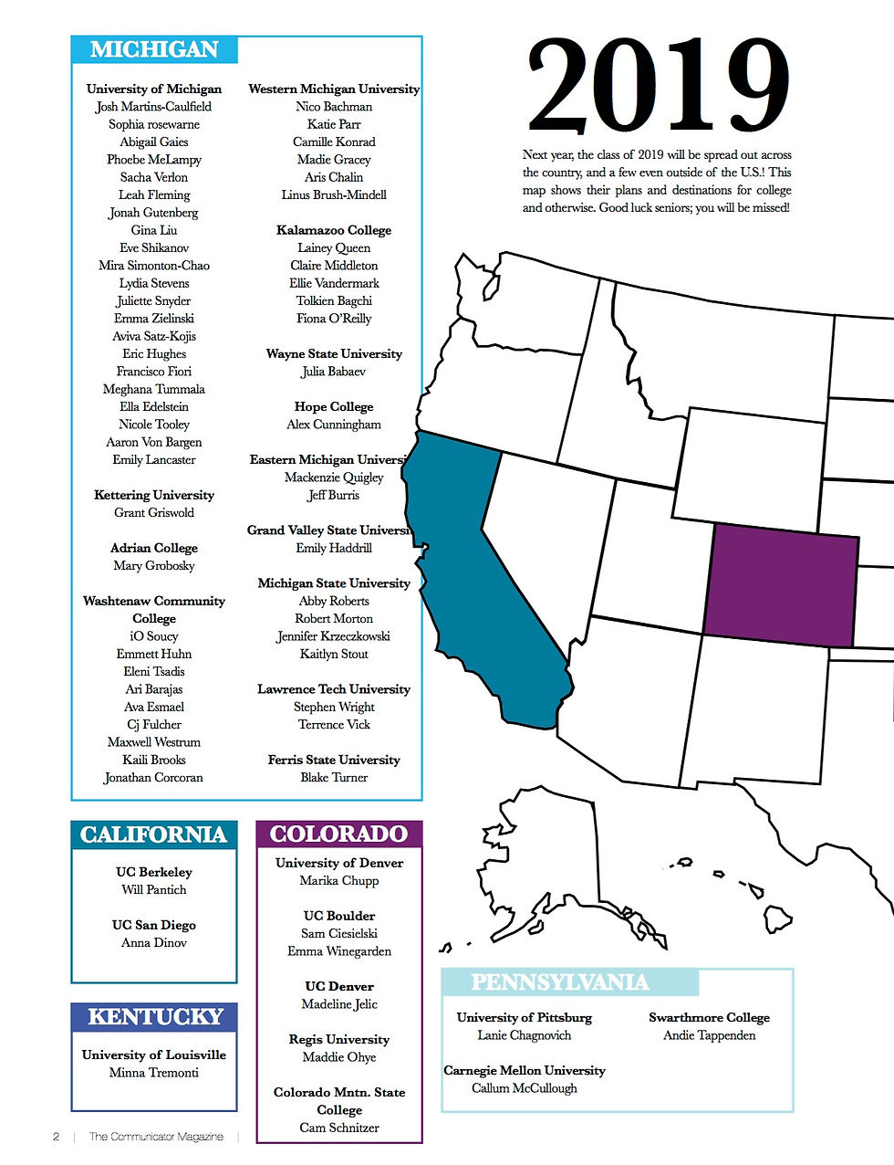
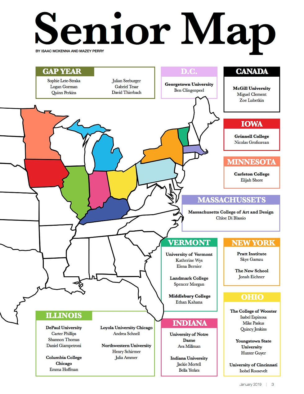

2019 Senior Map
A staple for scholastic press "senior editions," I spent hours with my colleague collecting data on the senior class' plans for their first year out of high school. I then led design on the map itself, creating a clear, concise graphic.


Humans of Community
Our take on Humans of New York, this section is a great way to feature students with short, interesting stories to tell. The design had fallen behind, so I rejuvenated it to fit with our current theme.


24 Hours of Solidarity
I designed this spread for an article titled 24 Hours of Solidarity, on the topic of a man's protest in which he knelt for 24 hours straight. My goal was to feature the beauty and power of the photo as much as possible. By cutting the photo into words, I tied the pages together and allowed a great descriptor from the writing to be featured.